Getting started with Bootstrap 3
Twitter Bootstrap is an extremely popular front-end
framework designed to build websites and web applications. In fact,
it is a collection of tools leveraging HTML, CSS and some optional
Javascript extensions like dialogs or tooltips and is used to
facilitate user interface creation. Its documentation can be found
here.
The simplest way to start working with Bootstrap is to use a content delivery network or CDN which delivers
all the necessary files via the Internet. To use it all that is
necessary to do is to add a couple of links to your HTML file as will
be discussed later. A code snippet adapted from Bootstrap Getting started guide
is shown below.
It is an HTML file. In this template
the <!DOCTYPE html> declaration informs the browser that this
page is authored using HTML5. The meta tag <meta charset="utf-8">
is used to instruct the browser to use utf-8 encoding. Then the
X-UA-Compatible meta tag has something to do with Internet Explorer
and in particular if you use IE as your browser, which supports a
number of compatibility modes, the latest version of the mode is
used. The last meta tag is used to deal with small-screen devices like
smart phones and deserves further consideration.
The Bootstrap is often described as a
“mobile first” front-end framework, so it pays a lot of attention
to how the page is displayed in mobile browsers. The viewport meta tag
was introduced by Mobile Safari browser and now is supported by many other
modern mobile browsers. The Apple documentation describes it here.
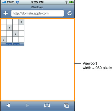
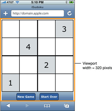
Long story short a mobile browser by default displays your
application in the upper-left corner.
By adding the width=device-width
the app is stretched to fit the visible area.
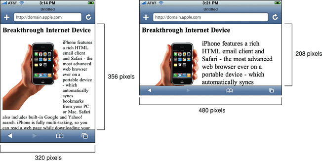
The second parameter, initial-scale=1,
controls how your app is rendered when the orientation of a device is
changed. If an app is in portrait orientation, it looks like that
then if the initial scale is set to
one, changing orientation to landscape renders app like the right-hand example above, so that the new width is inferred and
set to device-height
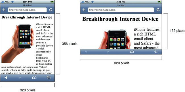
for you. But if the initial scale is not set, the app looks like the right-hand
image below shows.
Actually, it was merely zoomed.
The link and script tags in the template are used to
load all the necessary files from the CDN.
To
begin with your application just change the title and add your tags
to the body section of the template.
Additionally,
a new tool called Bootlint, which
is used to check your HTML + Bootstrap pages for errors, can be
added. All results are printed to the console, just press F12 to open
it. The simplest way is to use a bookmarklet
which can be obtained here.
Instructions for how to add a bookmarklet in Chrome are here
and in Firefox here.
If
you use Chrome browser an extension
adds a button to the toolbar, which allows to check your code in a
single click. To test the capabilities of Bootlint try to comment out
some of the meta tags in the template,
open
it in your browser, click the bookmark or a button in Chrome
and watch what happens in the console next.
Also, there are some useful examples
provided in docs/examples folder of the Bootstrap sources, which can
be used as a basis of your project. It is interesting that the
recommended on the Bootstrap site way to obtain the sources using
Bower do not provide one with the docs folder for it is added to
ignored list in bower.json file in the GitHub repository as of
version 3.2.0. The workaround is to clone the Bootstrap repository
using git.
All examples can be previewed here.
Moreover, you could share your work
online on Bootsnip where a lot of nice
bootstrap snippets are posted and can be previewed instantly.


Comments
Post a Comment